7 Webinar landing page tips
A webinar is an effective digital platform that helps you reach your business goals and build brand awareness. Though it’s cost-effective, it requires a lot of preparation in terms of creating engaging content to deliver, finding the right speaker, setting up the background, and more. But all these efforts can go into vain if you don’t get enough signups for your webinar. Ultimately, your webinar’s success depends on the number of registrations you get. Thus, you’ve to create an effective webinar landing page to hook online visitors to sign up for your webinar.
In this post, we’re sharing the 7 best tips to help you create a webinar landing page that converts.
Make it look captivating
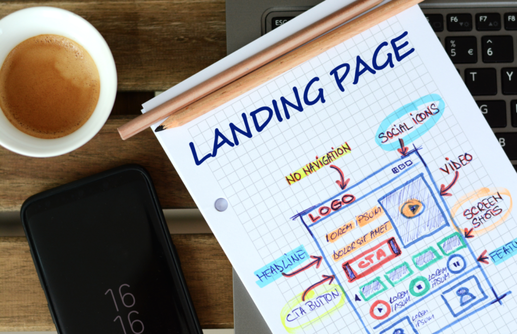
The first thing that you must focus on while creating your webinar landing page is the design. According to the recent reports, the website visitors spend only a few seconds on a landing page to take action. Thus, you must spend enough time to create a landing page with attention-grabbing images, title, CTA, and other essential elements. Also, if the design of your landing page doesn’t look professional or pleasing, it creates a bad impression for your brand and people might get hesitant to register for your webinar.
Try creating multiple landing pages
Instead of sticking with a single webinar landing page, you can create multiple landing pages based on your target audience. For example, you can’t show the same content for your existing customers (purchased your product before), past webinar attendees, and a new audience. So, if you create a different landing page for each group of audience, there is a high chance that you get more conversions. Besides, it also helps you to effectively run an ad campaign on Facebook or google ads. You can create multiple ad groups in your paid campaign with different landing pages to find which works best for you.
Mobile-friendly page
While creating webinar landing pages, ensure that it works fine on any device. If your landing page doesn’t work on mobile then you’re certainly going to miss registrations from a large group of audiences. So it’s important to go for a responsive design. If you don’t have a designing team to create a mobile-friendly landing page, you can create one with the help of Eventzilla Joinlive.
Be choosy on the headline
Your landing page visitors will decide on whether to continue reading the rest of the page only if they find the headline is useful for them. Therefore, you have to be meticulous about giving a headline on your webinar landing page. You should think of something that creates curiosity among the audience to read it further.
Click here to find some best headline samples.
Event description that drives attendance
The event description or body content of the landing page is vital when it comes to converting your visitors into actual registrants. But you can’t overload the content on the description part, as people spend only a little time gathering information from your landing page. Thus, you have to make it short and crisp. With a short description, you should be able to convey the benefits your audience can gain by attending your webinar. You can also keep the content conversational by using the word “you”.
Importance of registration form
Yes, a registration form helps you to gather your required information from your audience. However, you can’t overdo it. More the questions you ask, the fewer will be the conversions. Apart from some mandatory fields like name, mobile, and email, you can ask your audience to select an option from the drop-down boxes to gather additional information that you’re looking for, as it saves a lot of time.
Similar to your landing page, your registration form should also be mobile-friendly. Also, ensure that you give an attractive CTA on the registration form.
Let your audience watch a video
According to the industry sources, a webinar landing page with a video converts 80% better than the ones that don’t. You can create a short teaser video that explains the uses of attending your webinar. Also, you can showcase your upcoming webinars in a video. Most importantly, adding a video on the landing page creates a good impression for your brand.


